
Overview
Company
CI Policy
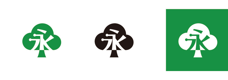
Corporate Logotype
The logotype is developed in Korean alphabets, simple but well-harmonized with the symbol mark.
The logotype is designed to be simple, but well-harmonized with the symbol mark to express Younglimwon’s philosophy
which emphasizes humanity and scientific digital management for enterprise innovation.
The corporate logotype is intended to be used together with the symbol mark, but it can be used separately.
The logotype is developed in Korean alphabets, simple but well-harmonized with the symbol mark. The logotype is designed to be simple, but well-harmonized with the symbol mark to express Younglimwon’s philosophy which emphasizes humanity and scientific digital management for enterprise innovation. The corporate logotype is intended to be used together with the symbol mark, but it can be used separately.
Symbol

